If there’s one thing the digital marketing revolution has given us, it’s data. With metrics being thrown at us from myriad sources, most of us probably have more numbers than we know what to do with. With so much data available, we have the capability to measure the performance of our marketing campaigns in a way that John Wanamaker could only dream about.
But how can we best utilize those figures to not only measure our performance but inform our future decisions without getting bogged down with the numbers that don’t matter? Let’s take a look at how reporting dashboards can help marketers navigate vast oceans of data—and save countless hours along the way.
-
Spend less time reporting, more time doing
We’re sure many of our fellow marketers can relate to the amount of time spent reporting. In particular, compiling the same report each week, week after week; the same metrics in the same format for the same people. Each report might only take an hour to put together but, over a few months, that’s a lot of hours you could have spent optimizing your bid adjustments, updating your negative keyword lists, and split-testing ad copy changes. There’s got to be a better way! A reporting dashboard will slash the time it takes to compile and assess data, freeing you up to do what you do best.
-
Build the right report for the right job—and the right people
As performance marketers, we’re obviously big fans of actually measuring that performance. Of course, it’s never simply a case of looking at the numbers. With so many metrics on our screens, we could probably find one or two that are heading in the right direction—but that would be cheating! That’s why the selection of specific metrics as our key performance indicators for each activity is so important.

We define those KPIs making sure they align with the tactical objectives of each campaign and ensure that we have a robust process in place to capture and store data. With our KPIs appropriately defined and the infrastructure in place to collect data, we can then think about our reporting strategy. Again, there isn’t a “one size fits all” approach to reporting: the reporting structure has to align with the activity and the business model.
- How often should you report?
- What should the comparison period be?
- How do you present data in different ways to different stakeholders?
- How is the data communicated and made available to the key people?
-
Use the dashboard platform that’s right for you
There are myriad dashboard-building tools available, from fully featured business intelligence solutions (e.g. Qlik) to coding your own interactive webpage using a data science language such as R or Python, with their range of analysis and data-visualization packages. For simple, headline performance reporting, you could even build a custom dashboard directly in Google Analytics, layering additional information with Google Analytics’ Data Import functionality.

The key thing is to be aware of your different options and choose the one that’s best-suited to your situation. If you don’t need to apply advanced statistical modeling to data that’s brought together from multiple systems, then you can save on upfront and maintenance costs by using a simpler solution. However, it’s always worth thinking about how you might use data in the future so you can avoid having to start from scratch again if your needs change.
One solution that we’re big fans of here at Proove is Google Data Studio. Using Data Studio, you can easily link your Google platforms such as Analytics, Ads, and Search Console. For your data that exists outside of the Google-sphere, you could import that into a Google Sheet and connect that directly, use a service such as funnel.io or Supermetrics, or even build your own solution to connect your favorite data source to your dashboard.
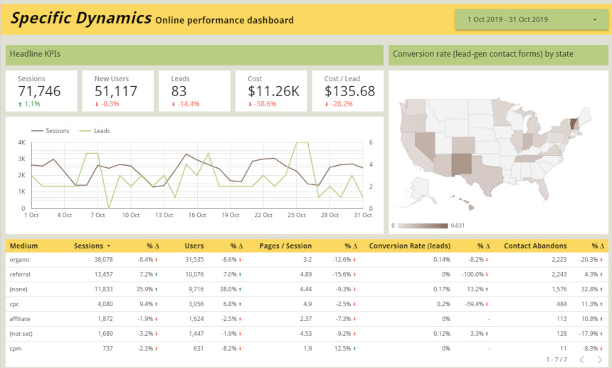
To summarize, you can easily reclaim the time you would have spent searching for those KPIs spread across multiple reports and copying them into a spreadsheet. You can design your dashboard to provide you with time period comparisons, filters that let you drill into the headline figures with more granularity, or even join data from different sources to let you calculate new metrics. And, when someone needs to check some figures, all they need to do is visit a webpage. You can say goodbye to those emails asking you to check the Google Ads spend for last Wednesday.
However, one of the most important benefits of dashboarding is that it forces you to decide on which KPIs are important to you. By going through this process, you have the opportunity to define a clear set of metrics to measure your performance, and audit your data sources to ensure that they are being collected correctly.
Do I need a marketing reporting dashboard?
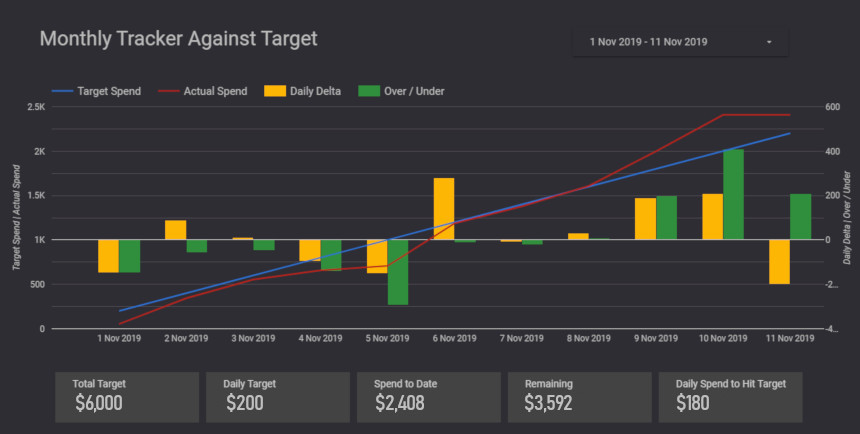
While a dashboard might not offer huge advantages for every business, even those with minimal reporting needs might see the benefit in being able to see ad spend against target quickly, conveniently, and accurately.
While some additional time is required up-front to build the dashboard, you may find the few hours spent putting it together come back to you fairly soon, but the amount of value you will gain from a reporting dashboard will depend on whether you are likely to use it or not.
Want to create a dashboard that streamlines your reporting and saves you countless hours? Find out exactly how to build your own analytics dashboard in part two.
