In part one of this two-part series, we explored how reporting dashboards can be used to break your data out of silos to help you see the bigger picture of your marketing performance—and save countless hours along the way.
In part two, we’re going to show you exactly how to build a basic reporting dashboard using Google Data Studio. In four simple steps, we’ll build a basic paid performance reporting dashboard and show how you can use Google Sheets to quickly bring together metrics from your multiple advertising platforms. Let’s get to it!
-
Define what you want to report
We’ve already established that digital marketing is not short of data. With so many dimensions and metrics, you could quite easily fill a dashboard with headline numbers, performance trends, and granular breakdowns. But that’s not necessarily what a dashboard is for.
Before you even open Google Data Studio, make sure you have a clearly defined set of KPIs on which you want to report. These KPIs should be related to the specific objectives of the activity. For example, a Google Shopping campaign may be targeted on return on advertising spend (ROAS), whereas a brand awareness display campaign might be better measured by the acquisition of new users.
For the purposes of this post, we’ll assume that you have a defined set of KPIs, and that these are all being recorded accurately with a Google Analytics implementation.
-
Set up the project
We’re going to use Google Data Studio as our interactive reporting tool and Google Sheets to manage our non-Google data. Granted, using Sheets does introduce some manual work into our project, but it is a solution that is not only easy to implement but integrates natively with Data Studio.
To get started, you’ll need access to a Google account—ideally the account you use for your Google Analytics access. With that, you can navigate to Data Studio, create a new report using the icon, and open a blank spreadsheet in Google Sheets. Once that’s done, it’s almost time to put on your hard hat and start building.
-
Prepare the data
A reporting dashboard can only be as good as the data that feeds it, so keep the GIGO principle in mind: garbage in, garbage out. In Google Sheets, we’re going to build a table that contains our daily spend and revenue data for three advertising platforms: Google Ads, Bing Ads, and Facebook Ads.
There are couple of ways we could design this table. Because we want to be able to aggregate and filter our channels, we’re going to design it following the best practices of a “dataframe”. This design is based around the concepts of one variable per column and one observation per row. In our case, this means that instead of having numerous columns for date, Google revenue, Bing revenue, Facebook revenue, Google Spend, Bing spend, and Facebook spend, we will instead limit ourselves to columns for date, channel, revenue, and spend/cost:
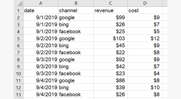
Because Google Ads data is easy to connect directly to Data Studio, we could integrate it directly in the dashboard by “blending” the data sources. For this tutorial, however, we’ll stick to the spreadsheet method. You should be able to populate the data using the figures from Google Analytics and the other advertising platforms.
-
Okay, let’s get building!
With our data source ready, we can get to work on our new dashboard. With our new report currently blank, the first thing to do is add our spreadsheet as the data source for this dashboard.
In the panel on the right-hand side of the screen, click ‘CREATE NEW DATA SOURCE’ at the bottom. That will take you to the list of “connectors” that allow you to choose the type of data source you want to connect. Hover over Google Sheets and then click ‘SELECT’. You’ll now see a list of the available Sheets you can use as data sources. Select the appropriate spreadsheet and worksheet, and click ‘CONNECT’ in the top right of the screen.
-
Set defaults and add new fields
We can now see an overview of the fields that have been pulled through from our spreadsheet, as well as a new Record Count field. Here, we can edit the defaults or create new fields here if we need to:
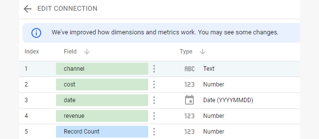
For our data, we’re going to change the Number type to currency for the cost and revenue fields. Use the drop down accessed by clicking on the small triangle. After that, just click ‘ADD TO REPORT’ in the top right, and you’ll appear back on your dashboard with a default table of our data:
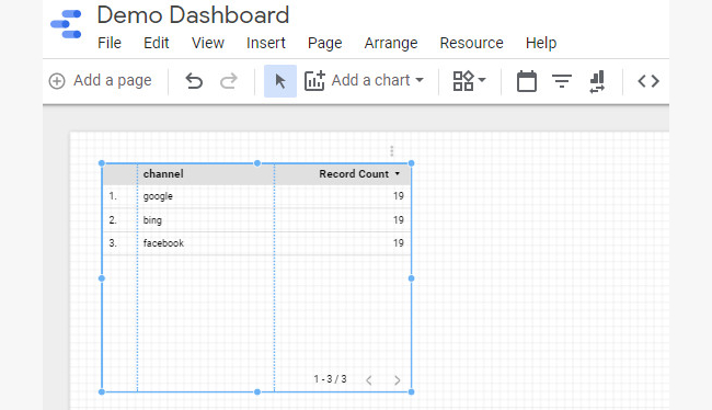
For this dashboard, we do want things broken down by channel, but Record Count isn’t a very helpful metric for us. Fortunately, changing that is easy—just drag the appropriate metrics from the Available Fields section to the Metrics section:
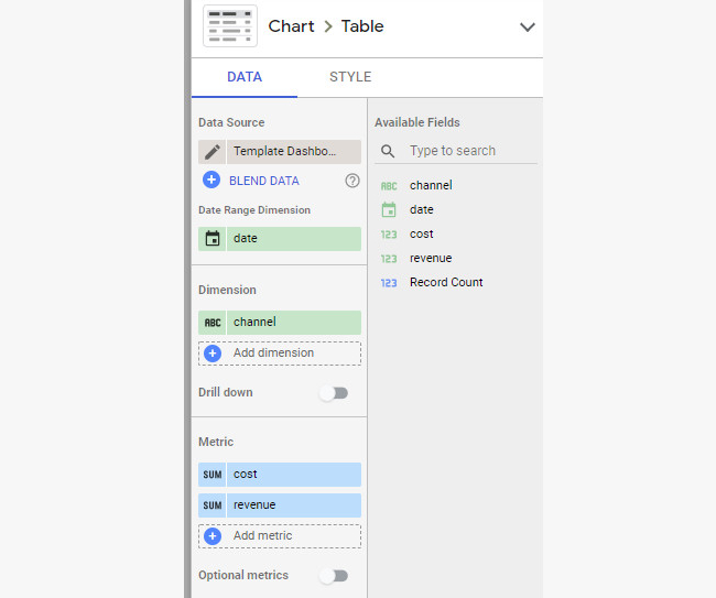
Okay, we’re getting somewhere, but what we really want to know is our return on advertising spend. Not a problem. Under the Metrics section, we’ll just click ‘Add metric’, then ‘CREATE FIELD’. In the box, we can simply name and define our new metric and add it to the table:
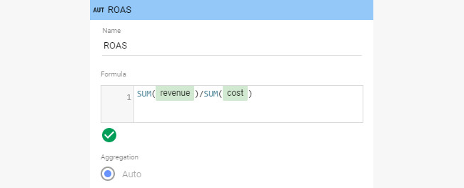
We’ve now got a table that works, but it’s not very useful if it just tells us everything that’s in the data source. We want to know if we did better this week than last week. To find that out, add a date range selector to our dashboard using the calendar icon. We’re going to choose ‘Last week (starts Monday)’:

With that on our dashboard, all the charts on that page will be restricted to the currently selected date range. To report our comparison period, we just need to go back to our table and select a comparison date range. If you select ‘Previous period’ for week-on-week reporting, you’ll see that the table has updated with Delta columns to show the change from the previous period.
-
View total revenue performance over time
Something else we want to see is the total revenue performance over time, but we’d like to be able to break that down by channel. Fortunately, given the way we designed our data source, it’s a piece of cake! Click on ‘Add a chart’ and select a time series graph. Add ‘revenue’ as the metric and you can see how it trended over time; we can also add our comparison here if we wanted.
-
Add a filter
To drill down into the channels, we need to add a filter. Add a filter from the component panel at the top (next to the data range selector) and make sure that ‘channel’ is selected as the dimension. With that added to the page, we can now select which channel or channels we want to look at.
-
Apply filters to visualizations
With a filter control added to the top of the page, it will apply to all visualizations on that page—which isn’t necessarily what we want. To apply a filter to one specific chart, simply select the filter and the chart together and group them by pressing Ctrl + G (CMD + G) or going to Arrange > Group.
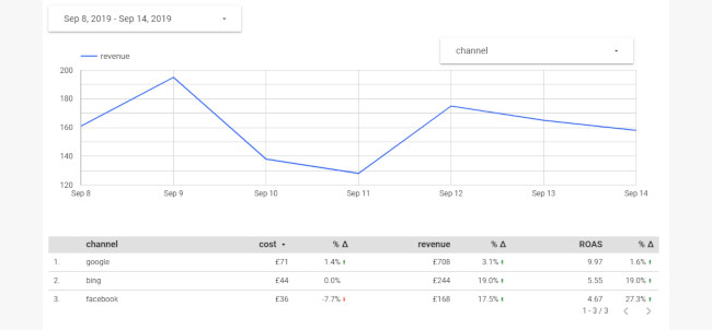
And that’s our dashboard underway! At this point, you’ll probably want to start tidying things up: branding the page with the appropriate logos and color palettes, renaming metrics (or at least capitalizing them!), creating annotations, and adding any other metrics on which we want to report.
-
Practice, practice, practice!
Now that you have the basics down, you’ll find that there’s so much more you can do from within Data Studio. You can create new fields and calculated metrics, or combine data from multiple sources to create automated PDF reports that can be sent directly to the relevant stakeholders’ inboxes. You can even incorporate data from Google Search Console or Google My Business and combine it with in-store revenues to understand the effect of online activity on offline income (ask our experts about that particular trick).
Of course, the Google Sheets solution we used for this build does require manual updating to keep the data current, so it’s not a solution that scales particularly well. Fortunately, there are more sophisticated methods to do the heavy lifting for you, including third-party solutions like funnel.io. You could also build your own tools to generate databases and connect to Data Studio. Simply set up a sandbox dashboard, connect a dataset or two, and see what you can do!
Any questions? Need a little help to take your reporting and analysis to the next level? We’re always available.
